Scaling the User Experience Across a Complex Legacy System
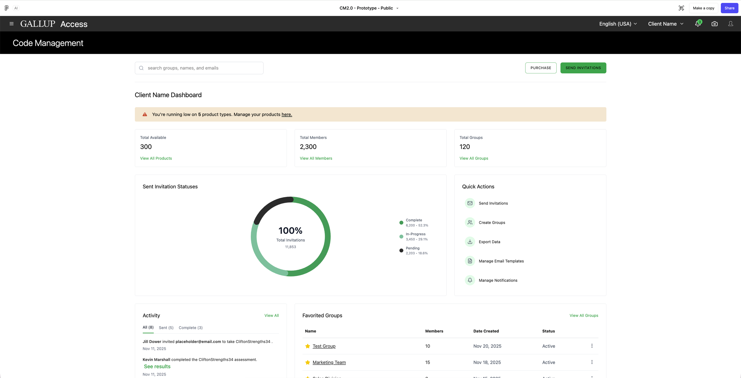
Code Management in is a tool within Gallup’s CliftonStrengths and Employee Engagement Platform Gallup Access, that allows users to access, organize, and send purchased CliftonStrengths assessment codes to recipients. It’s the centralized place to track assessment invitations and manage actions such as distributing, reassigning, or monitoring usage, making it easy administer assessments across groups, teams, and organizations.
Goals:
The current Code Management is confusing and inefficient, especially for enterprise admins, internal support teams, and coaches. I was tasked to simplify the Code Management distribution and management experiences, by making it easier to invite participants, track completion, and purchase additional assessments with minimal effort and full visibility. I was responsible for the deep dive analysis of the current tool, owning the research and design phases, and leading the overall design vision for this new experience, with 0-1 mock-ups within a 6 month timeline.
Key Partners:
Director of Product CliftonStrengths | Product Manager | Software Developer Leads | Head of Design
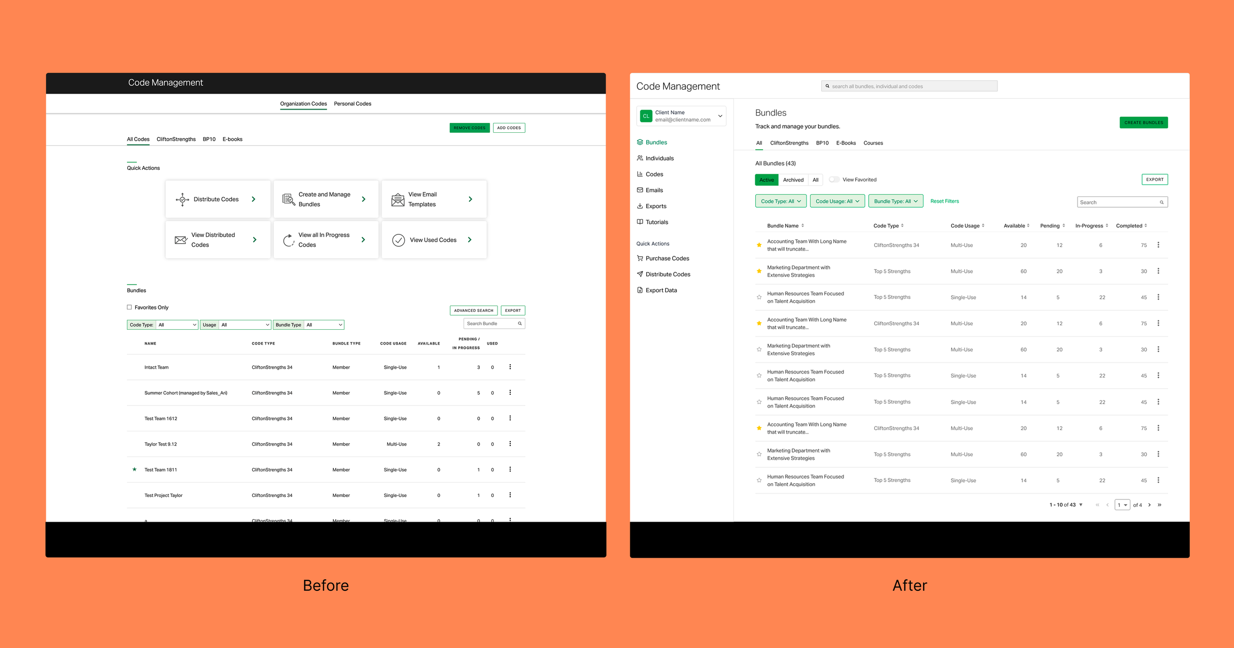
Before and After of the Enhanced Code Management Bundles Screen
User Discovery
Discovery was extremely important for this project as the team was looking for a large and much needed overhaul of the system from ground up. We were prepared to create a roadmap spanning anywhere between 6 months to 1 year. For the discovery portion, I created the scripts for user interviews and all recruitment emails and meeting messaging. I worked with PM’s to recruit users from 4 core user segments and alternated the responsibility of leading the interviews and taking notes in those interviews. I also synthesized all findings to define and organize user personas.
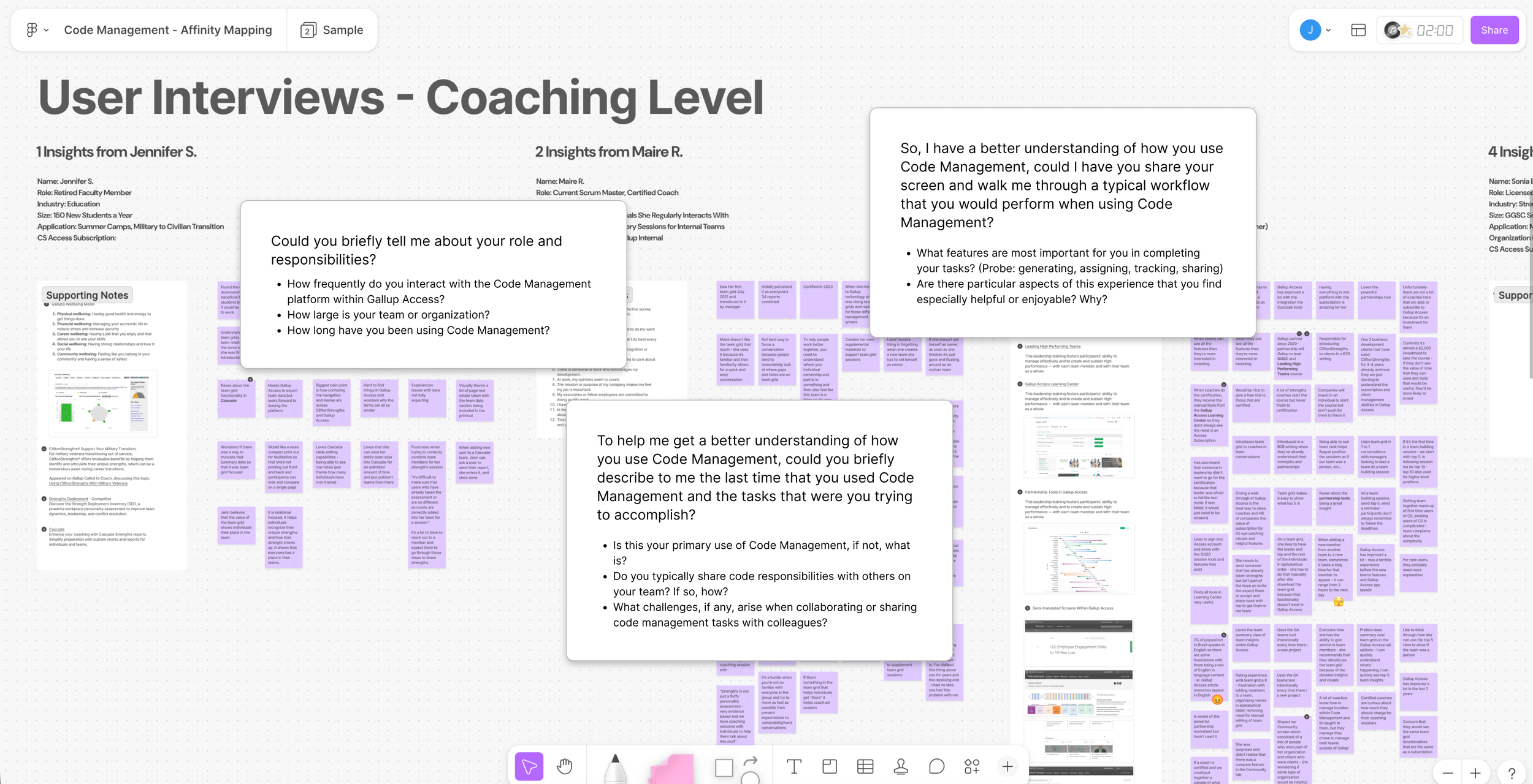
Affinity diagram of the user interview findings
I combined the summary of findings into a single powerpoint that I shared across the team and larger department. Within that powerpoint, and in an effort to give others a view into how the design team structures user interviews, I provided information on the methodology, questions and key findings. Key findings from the users interviews emerged around users wanting more tutorials, wanting, pain points around user, code, and assessment management, lack of error messaging, status labels, more comprehensive exports and usage reports, email management features, creating bundles from teams, and gettin individual results.
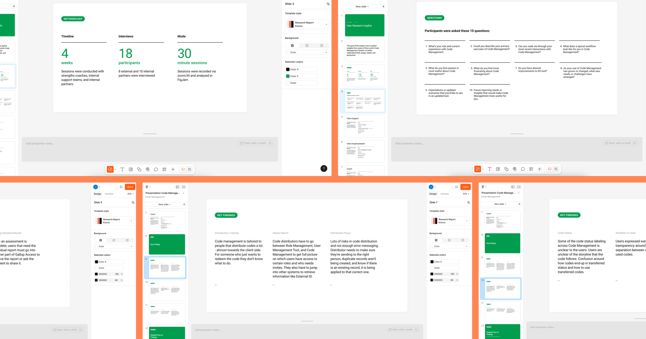
User interview findings presentation
How Our Users Move Through the System
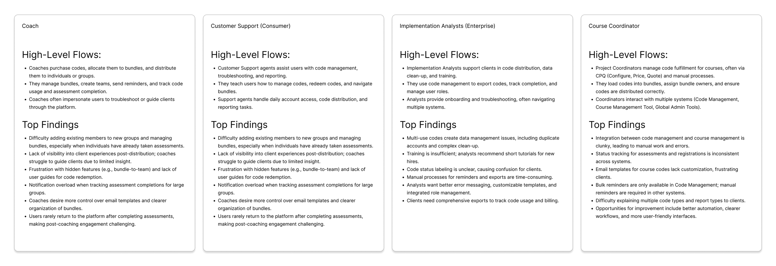
In addition to the research findings summary, I created a user journey maps for each of our 4 core user segments. The purpose of this was to understand the end-to-end flows each audience followed, identifying where their needs converged and where they diverged. This segmentation allowed me to map distinct tasks and workflows, clarify priority pain points, and ensure the redesigned system addressed both individual and enterprise-level complexity.
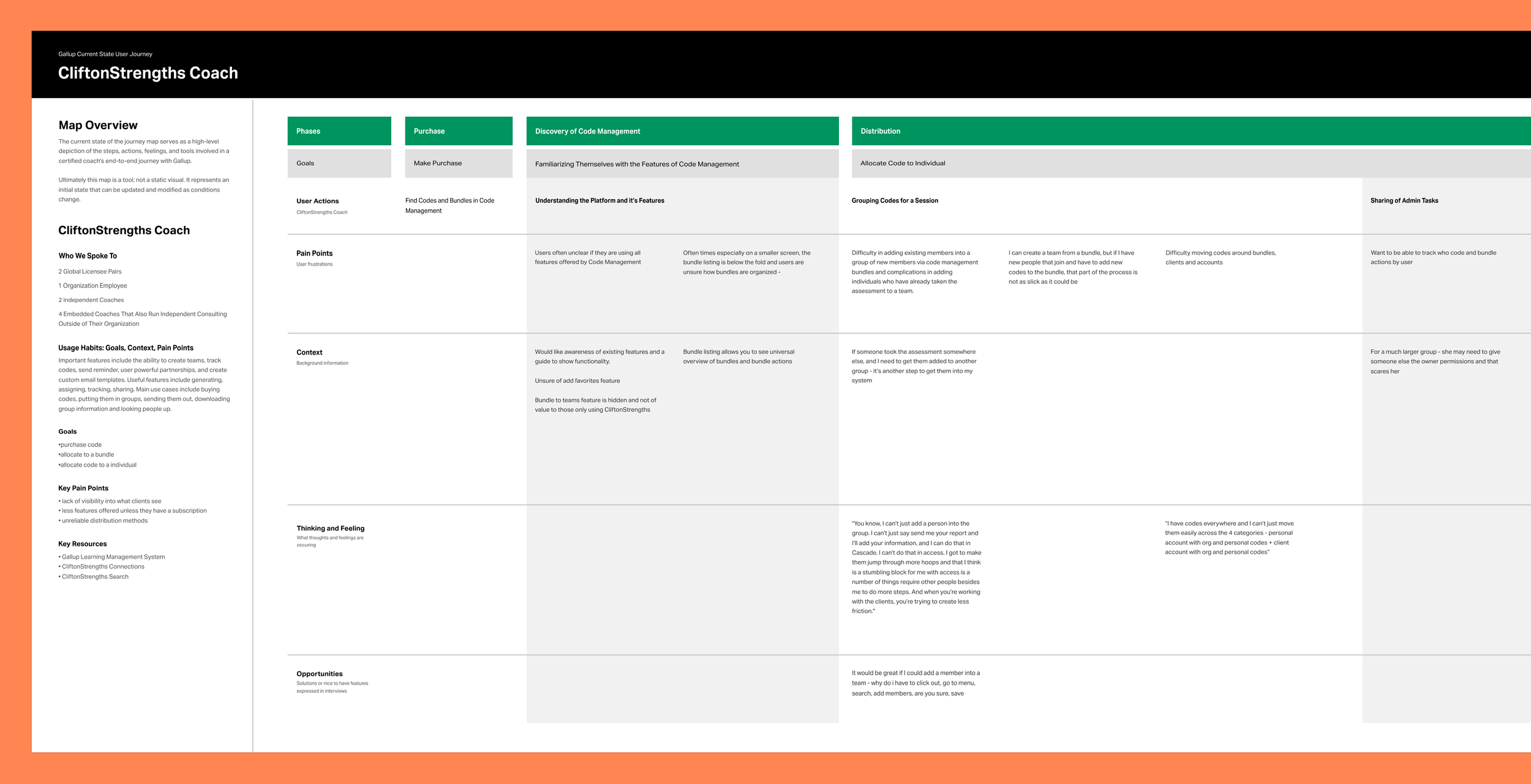
Detailed user journey documentation
Platform Foundations
Now that the team and I had alignment on the users, their journey through the system, and their biggest pain points I started discovery exploration on the platform and existing tooling. As I worked to understand the system and its core components, I conducted an initial pass at defining an object-oriented UX model. Using insights from user interviews, I used ChatGPT to synthesize recurring patterns and behaviors into simplified, reusable objects and relationships. This helped me to distill complexity across the platform and created a clearer foundation for structuring features, interactions, and system logic moving forward.
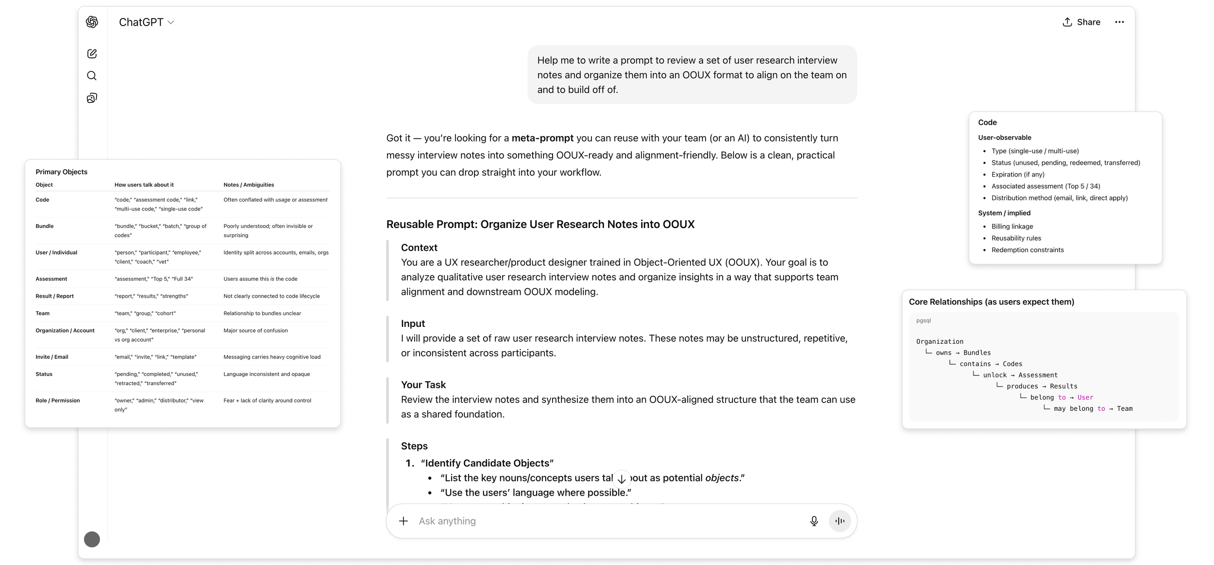
OOUX concepts generated from user interview scripts.
User Flows and Mapping
With a clear understanding of the core components, I mapped the current-state experience to define how these objects connect across features and the broader system. I developed a high-level sitemap to better understand the platform’s structure and screen relationships, which surfaced gaps in how different offerings were represented.
To deepen this, I partnered with my project manager and sales to document subscription tiers and associated feature sets. I then layered these into the sitemap, enabling a clear comparison between organizational and individual offerings. This helped reveal overlaps, inconsistencies, and opportunities to better align the experience with how the product is actually packaged and sold.
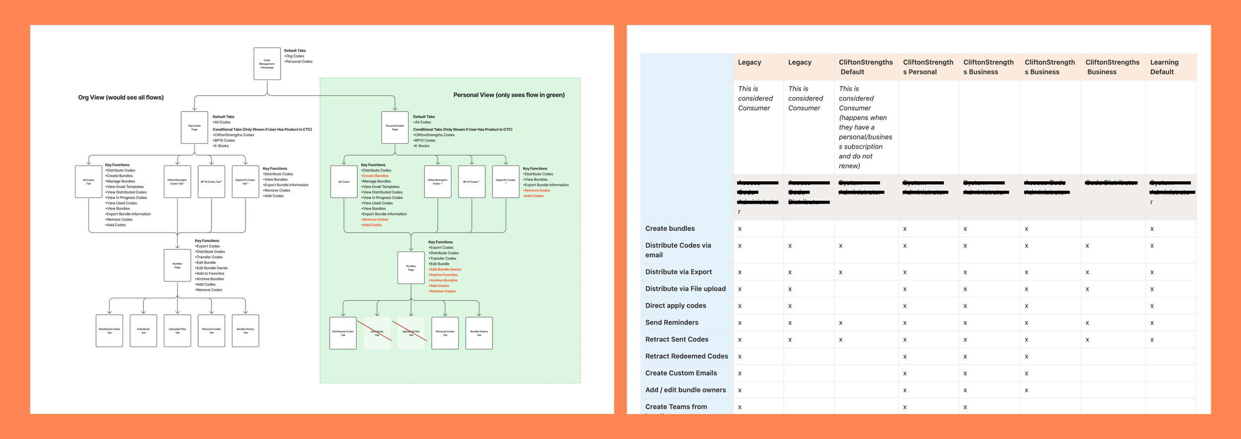
Sitemap and feature discovery which included a deep dive into user permissions and subscription tiers.
Current state sitemap documentation with key functions (tasks that users can complete in the current system).
Ideal State Flows
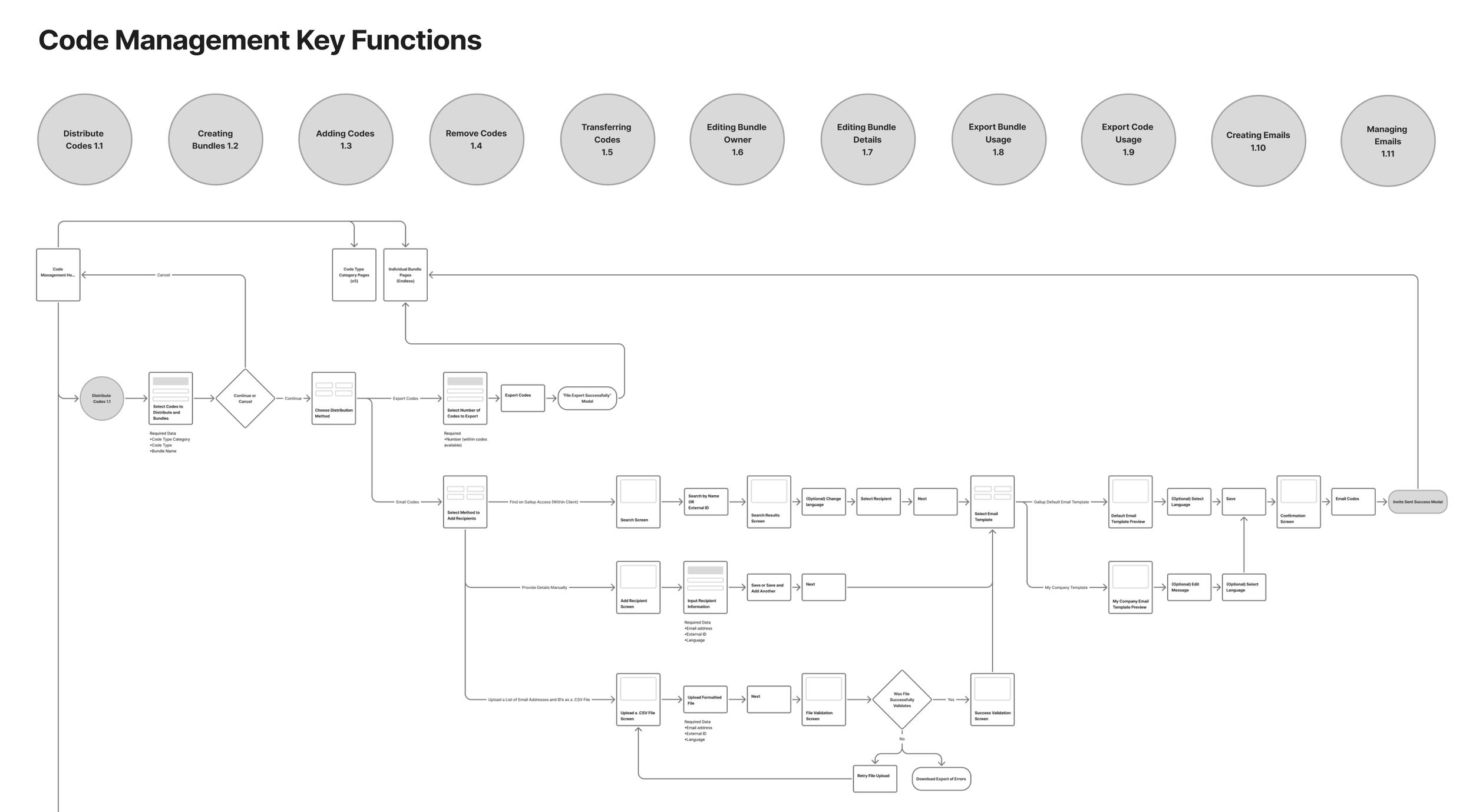
Next, I defined a series of ideal-state flows, focusing on areas where users experienced the most confusion. To accelerate my understanding, I benchmarked common patterns for similar workflows, using AI as a research aid to challenge assumptions and uncover gaps in my thinking. This allowed me to enter discussions with stronger context and more targeted questions.
Building on the current-state analysis, I mapped proposed improvements and clearly documented what remained consistent, what changed, and where larger opportunities existed. I partnered closely with product and engineering, facilitating weekly working sessions to review each flow, align on feasibility, and scope implementation. This ensured the proposed experience was both user-centered and technically grounded.
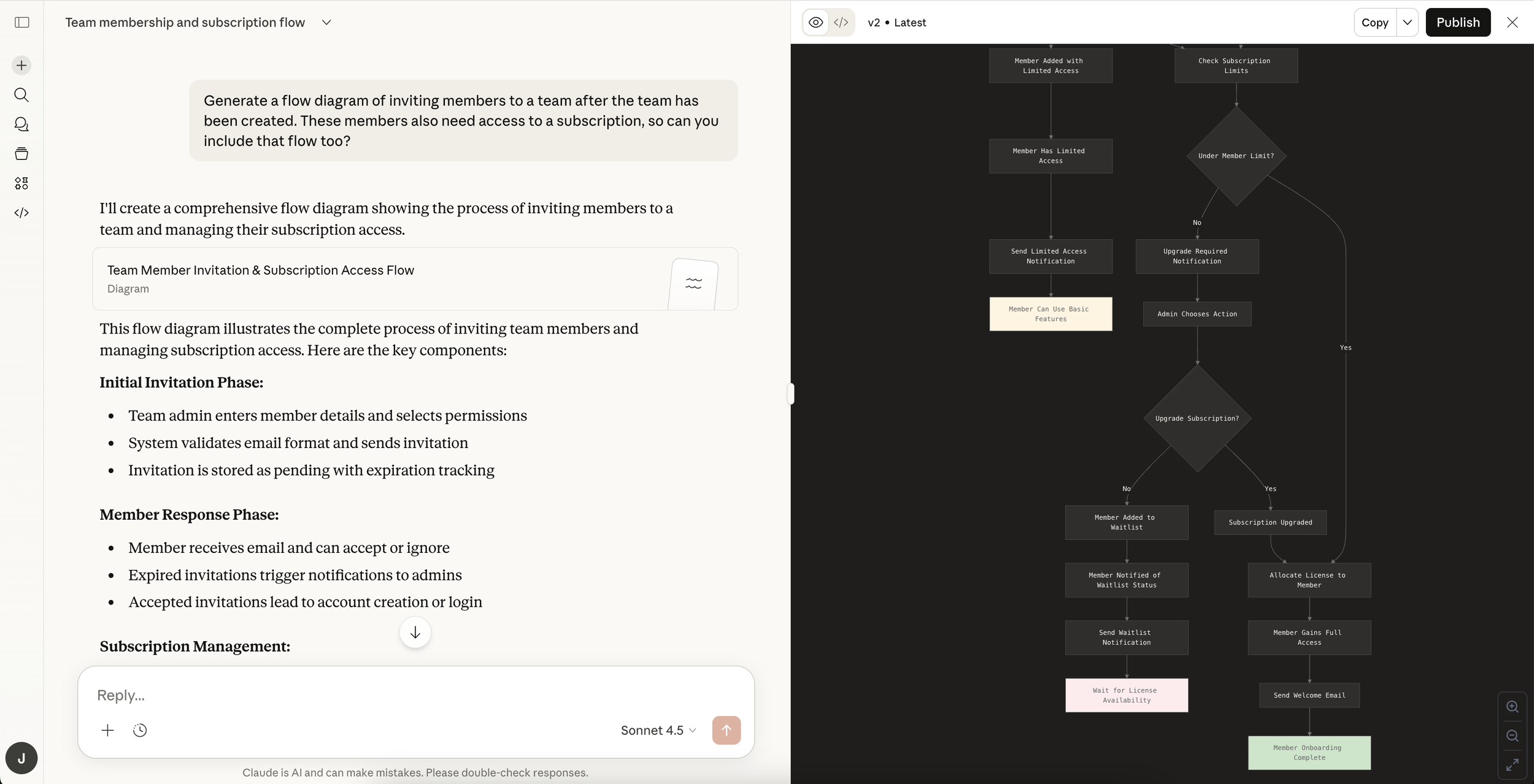
Exploring possible flows using Claude AI for learning and quick ideation.
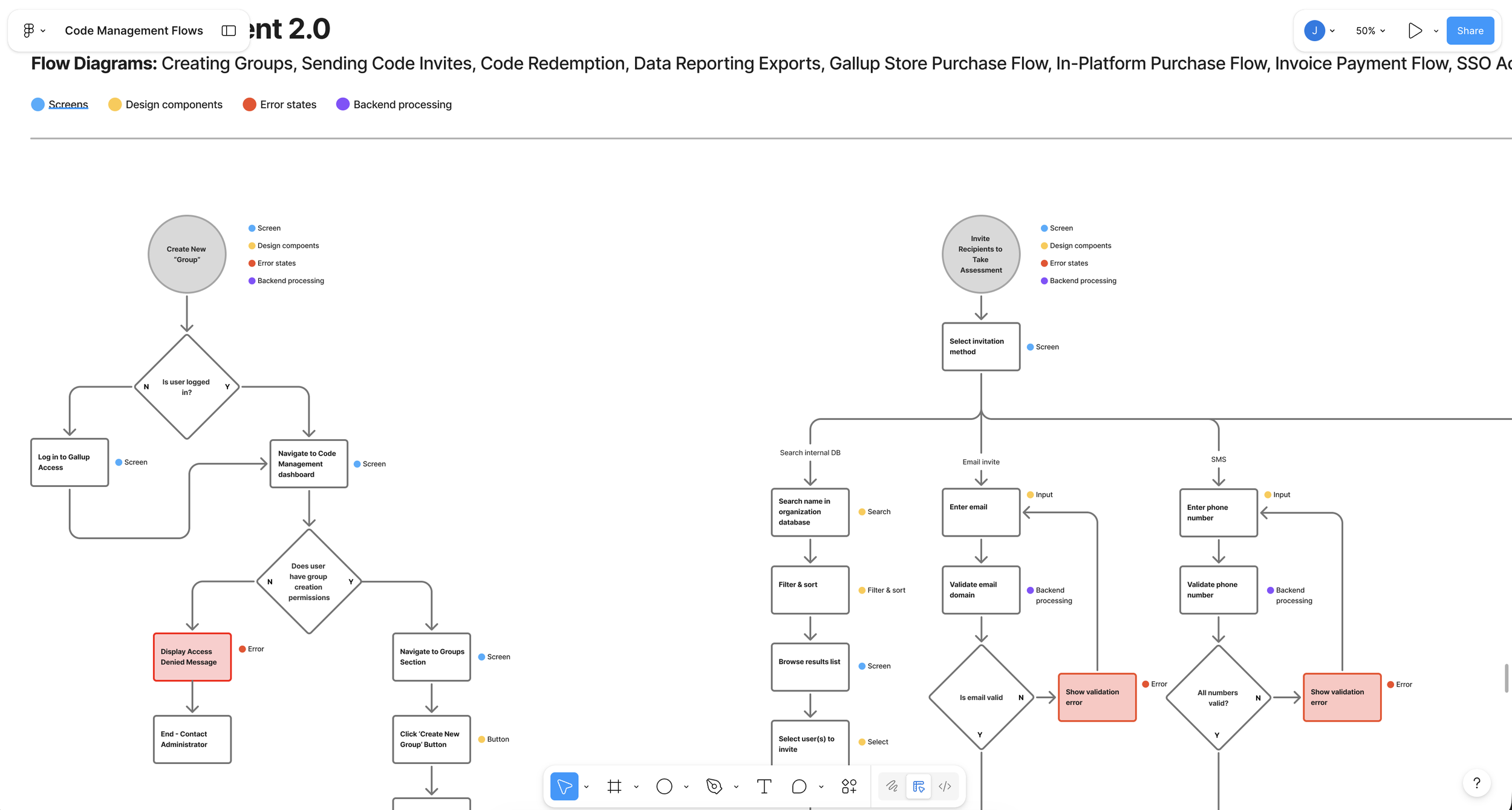
Translating AI generated flows into ideal flows for proposed updates to the system.
Once we aligned on the proposed flow updates, I iterated on each journey based on cross-functional feedback. I then facilitated a requirements definition exercise for every flow and supporting screen – clearly outlining what was existing, net-new, technically feasible, and out of scope. This created shared clarity across product, design, and engineering, and ensured alignment before moving into detailed design.
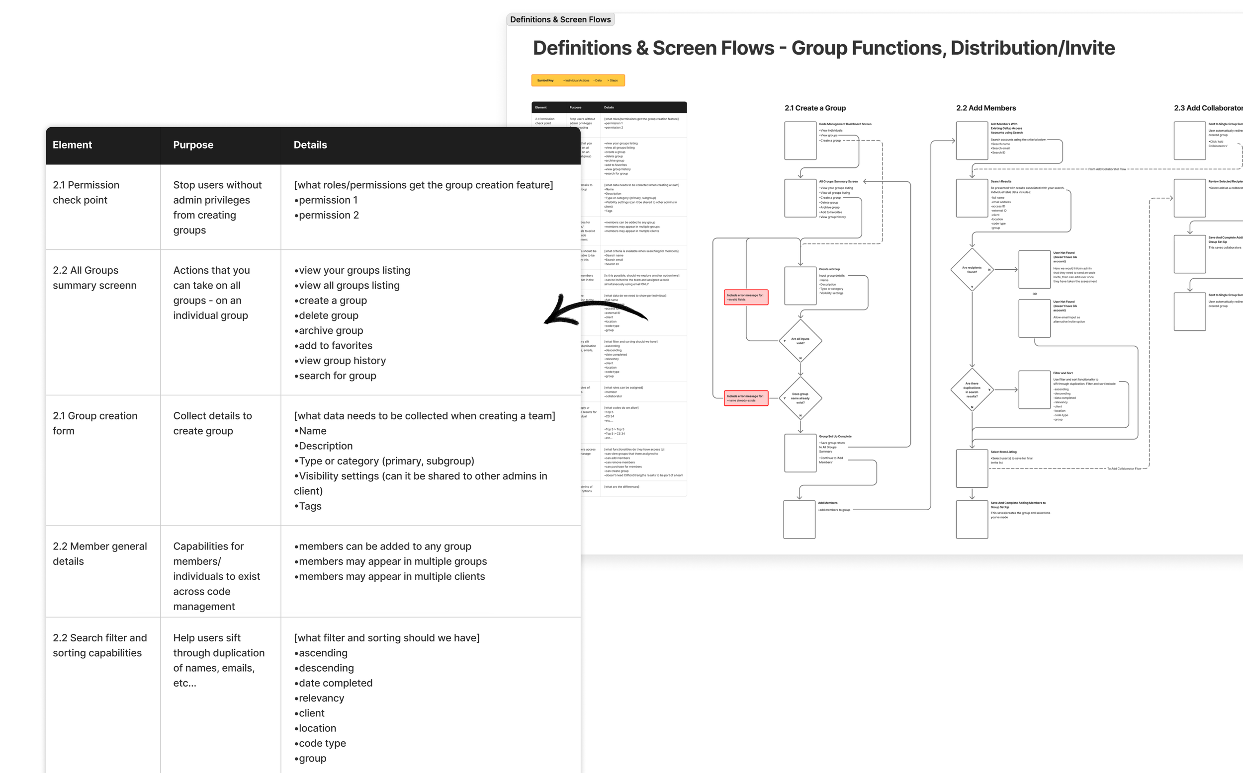
Individual flows and requirements documentation
For less functional, entry-point screens, I created a set of wireframes and modular content blocks to support requirements definition. These screens played a critical role in guiding users into more complex flows, so I ensured they were intentionally designed and accounted for in scope. This helped the team align on content structure, entry states, and how these touchpoints connected into the broader experience.
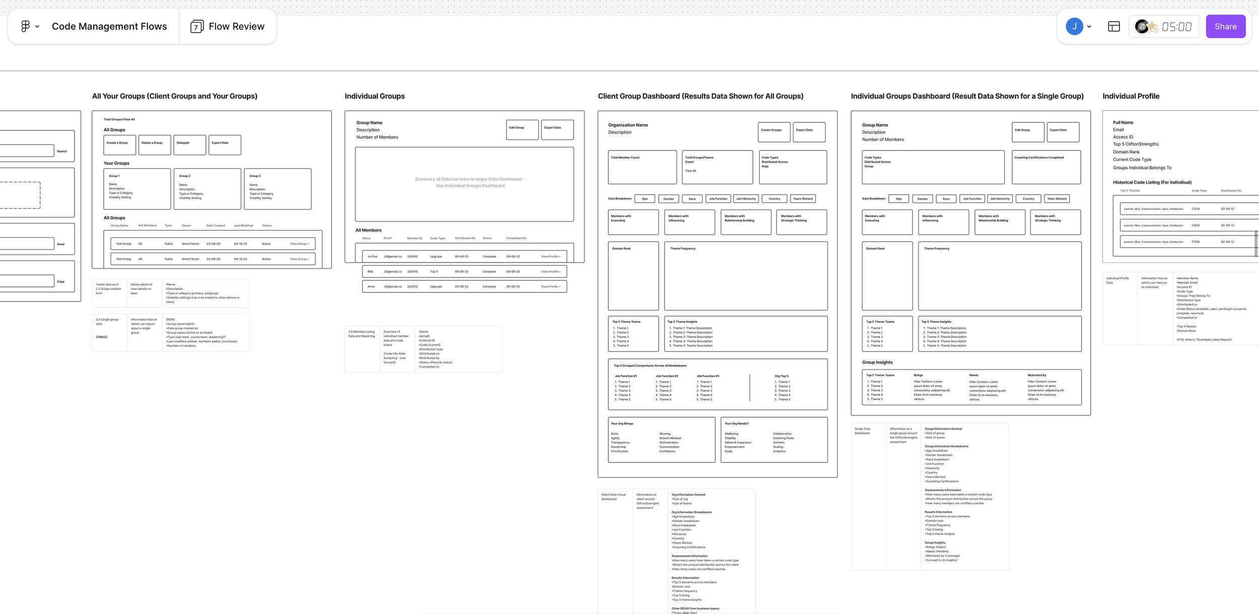
Non-flow wireframes with modular content blocks
Delivering the Designs
With alignment on the updated flows, I transitioned into design planning—mapping the key screens, features, and interactions needed to bring the experience to life. I identified dependencies across the system and defined how each touchpoint connected within the broader journey.
This phase required balancing reuse and innovation—leveraging existing components where possible, introducing new patterns where needed, and referencing competitive benchmarks to inform decisions. Through iterative UI exploration, I ensured the final designs were both cohesive within the system and aligned to user needs and business goals.
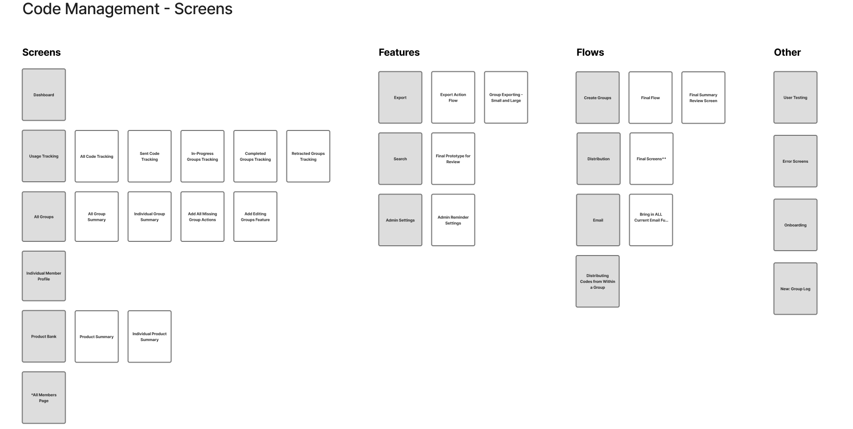
Laying out high level screens and flows to begin wire-framing
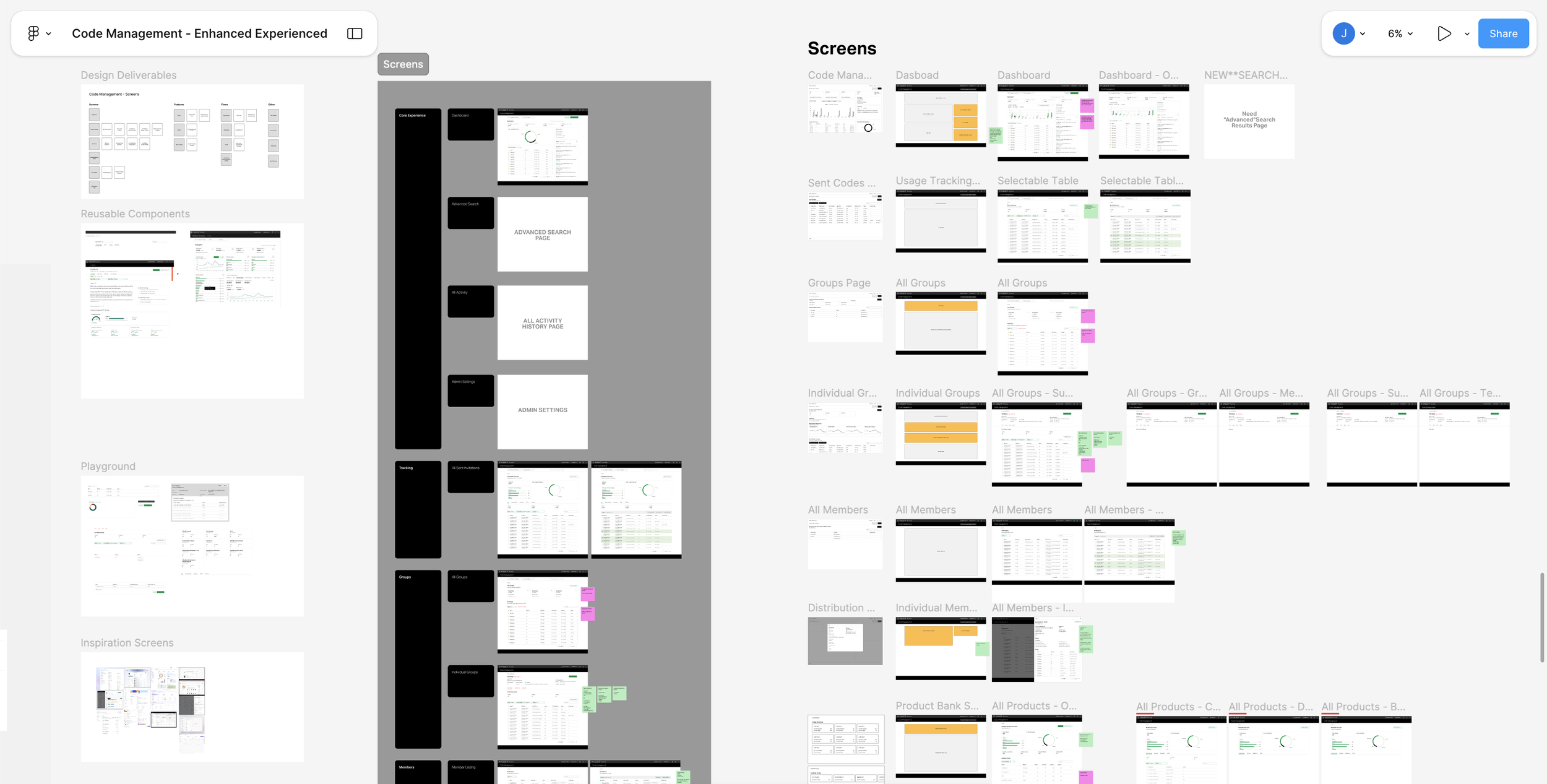
Document show Low fidelity wireframes to high fidelity mock-ups, exploration, and mapping of existing and new components.
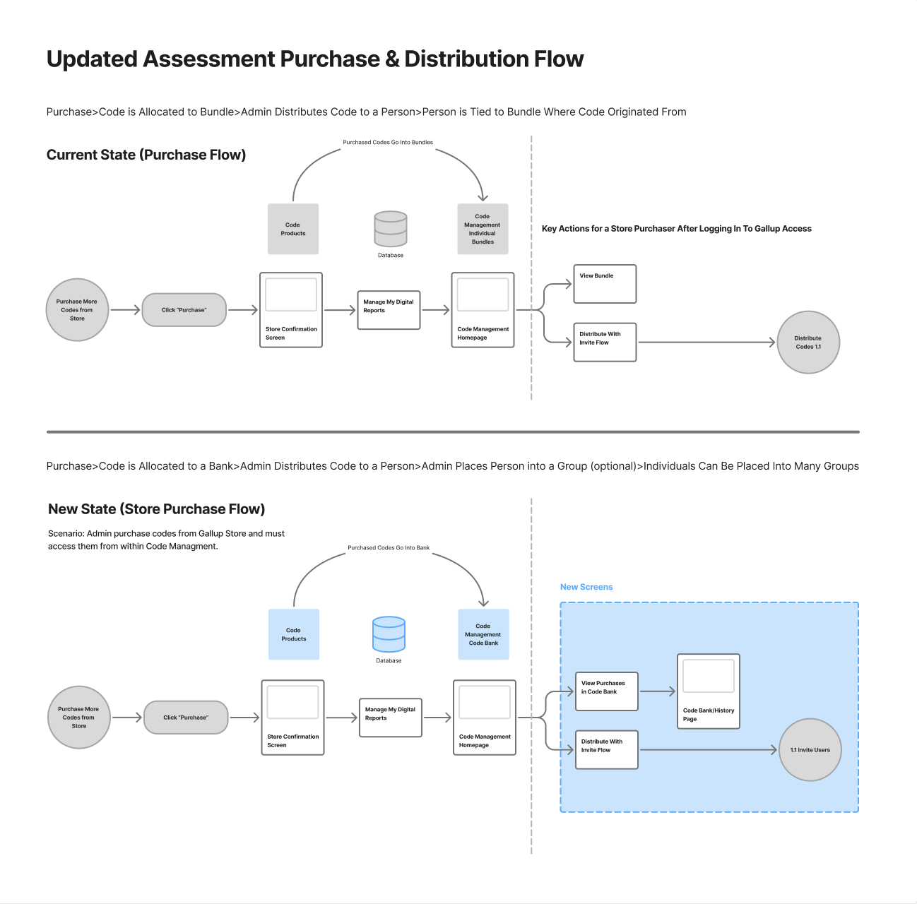
A Pause for Concept Testing
In the legacy experience, codes were purchased as fixed bundles and permanently tied to specific users and groups. This created rigidity, limited reuse, and introduced friction for administrators managing users across multiple contexts.
I reimagined this as a centralized allocation model. Instead of binding codes to bundles upfront, purchases are stored in a shared “bank,” allowing administrators to distribute access dynamically—assigning users to one or multiple groups without structural constraints.
This approach simplified inventory management, increased flexibility at scale, and more closely matched how customers expected to manage access and distribution, but it was risky because it would require a larger back-end lift. So I lead a session to concept testing sprint to test our assumptions.
Proposed update to Code Management enhancements.
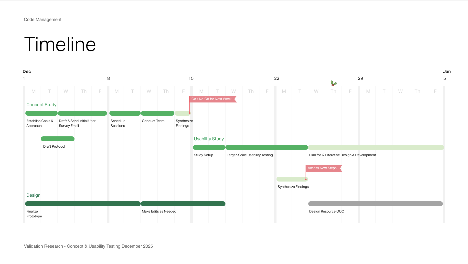
Timeline for concept and validation testing
For concept testing, I owned both the research plan and synthesis. I built interactive, data-rich prototypes in Figma to simulate realistic usage and partnered with the team to recruit a mix of new and existing users.
We evaluated whether the proposed model meaningfully improved the experience or introduced new complexity. While the concept showed promise, testing revealed that it didn’t deliver enough immediate impact. Users responded more positively to incremental improvements, so we pivoted—prioritizing smaller, high-confidence changes that delivered clearer value in the near term.
Figma Make prototype
Owning Design Deliverables
This project is currently in progress, with a strong focus on close collaboration with product and engineering to finalize scope and prepare for development. To manage complexity and maintain alignment, I implemented a lightweight planning system in Notion, tracking incoming and outgoing work while creating a high-level Gantt view for stakeholders.
This provides visibility into timelines, dependencies, and delivery expectations, helping the team stay aligned and move efficiently toward ticket readiness.
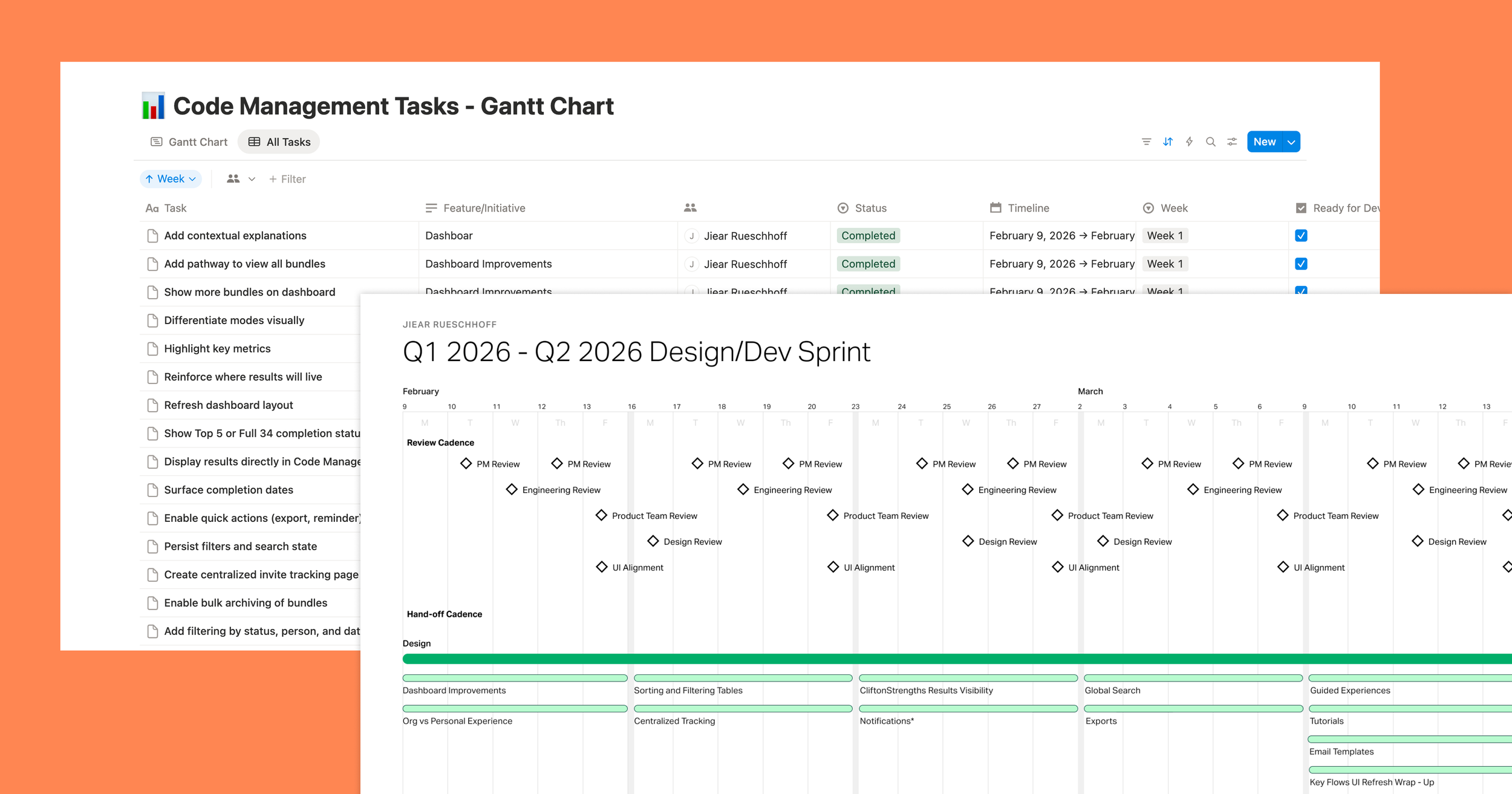
Designer planning deliverables owned by me
Project is Current In-Progress (metrics we plan to measure)
Revenue
Activation
Adoption
Retention
Gallup News Homepage
CliftonStrengths