A Better Way to Share and Compare on the CS App
CliftonStrengths is a science-based personality assessment that identifies individual strengths across 34 themes. With more than 30 million users worldwide including consumers, coaches, educators, and enterprise clients, it represents Gallup’s largest audience. While CliftonStrengths is fully integrated into Gallup Access on desktop, Gallup’s employee engagement platform, its footprint in the mobile app had been limited. This created an opportunity to expand its mobile presence and more effectively engage users within the mobile experience.
Other Considerations::
• I was given a 6 month timeline from kick-off to developer hand off of final mocks
• The app would be unveiled at Gallup at Work Summit the following June
• Development would be outsourced to an external partner
Goals:
I was tasked by our CTO with either building a new app from the ground up or integrating new features into the existing Gallup Access app. Key focus areas included making strengths easier to share and improving individual, group, and team visualizations. Targeted success metrics included increased downloads and usage, as well as greater awareness of the CliftonStrengths app and its new features.
Key Partners:
Chief Technology Officer | Directors of Software Architecture (across multiple teams) | Director of Software Development | Technical Project Managers (across multiple teams) | Director of Marketing | The CliftonStrengths Vertical Team | Junior UX Designers | Technical Mobile Leads | Content Writer | Content Editor | Software Developers (across multiple teams)
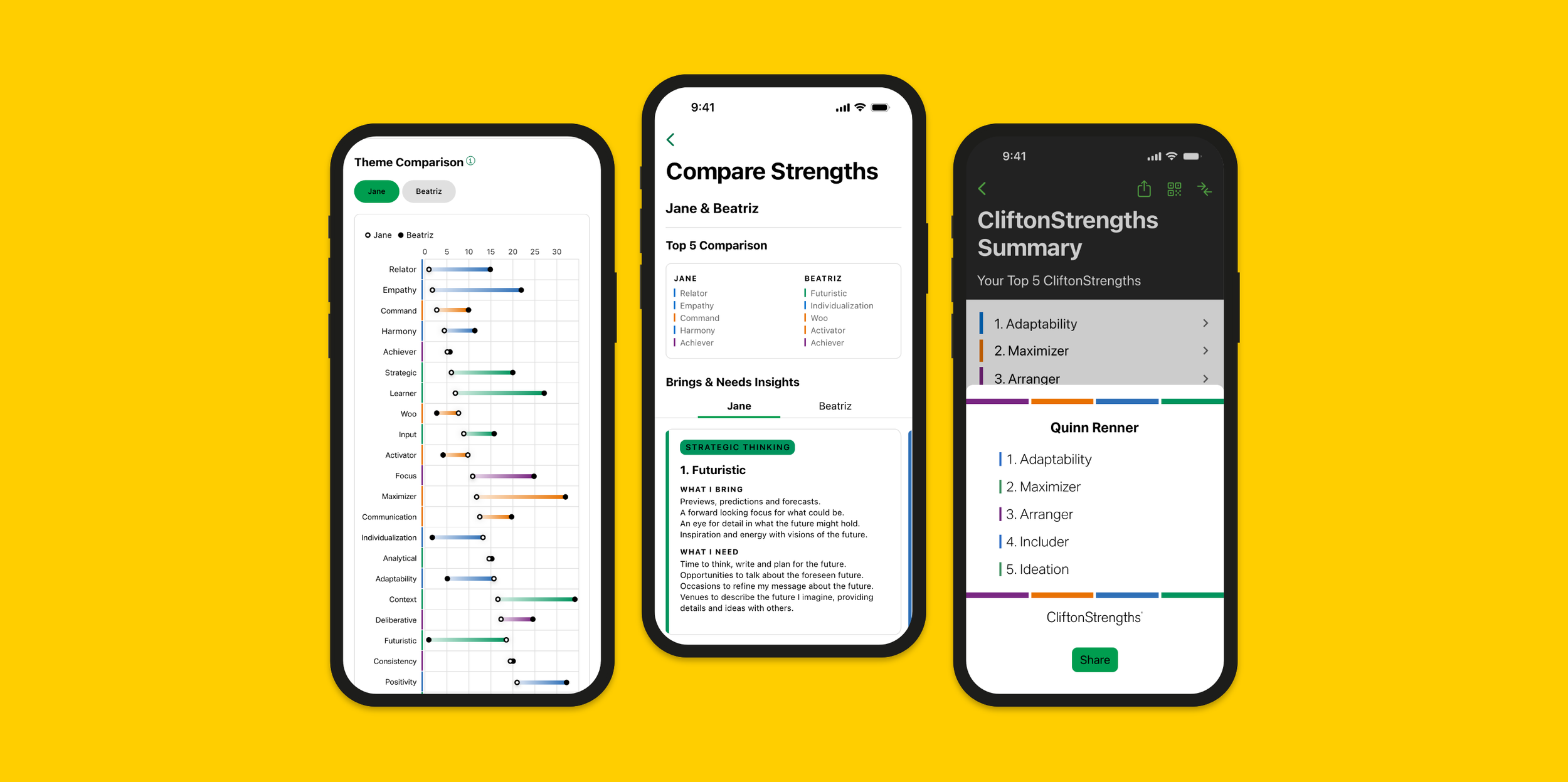
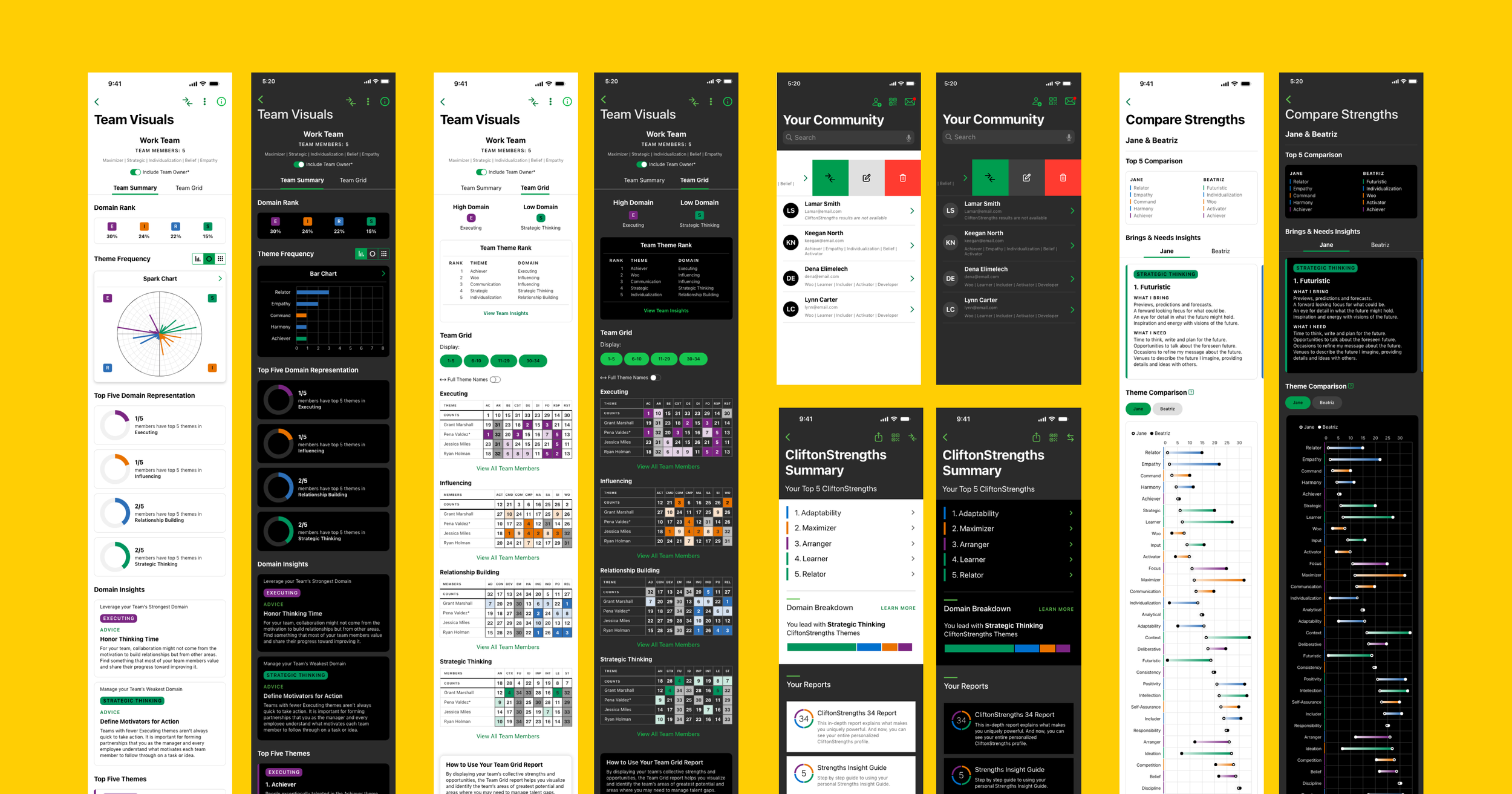
Screens from the new compare and team features that I had designed for the mobile app
User Needs in a Competative Landscape
As the project began, I focused on establishing a strong strategic foundation before moving into design. This approach helped clarify which problems needed to be solved and whether they were best addressed through enhancements to the existing app or a new standalone solution. It also provided a solid framework for ideation while allowing flexibility to pivot as insights emerged. To kick things off, I conducted five user interviews with internal power users of the mobile app, performed a competitive analysis of seven mobile apps in the personality assessment space, and ran two workshops to define user stories.
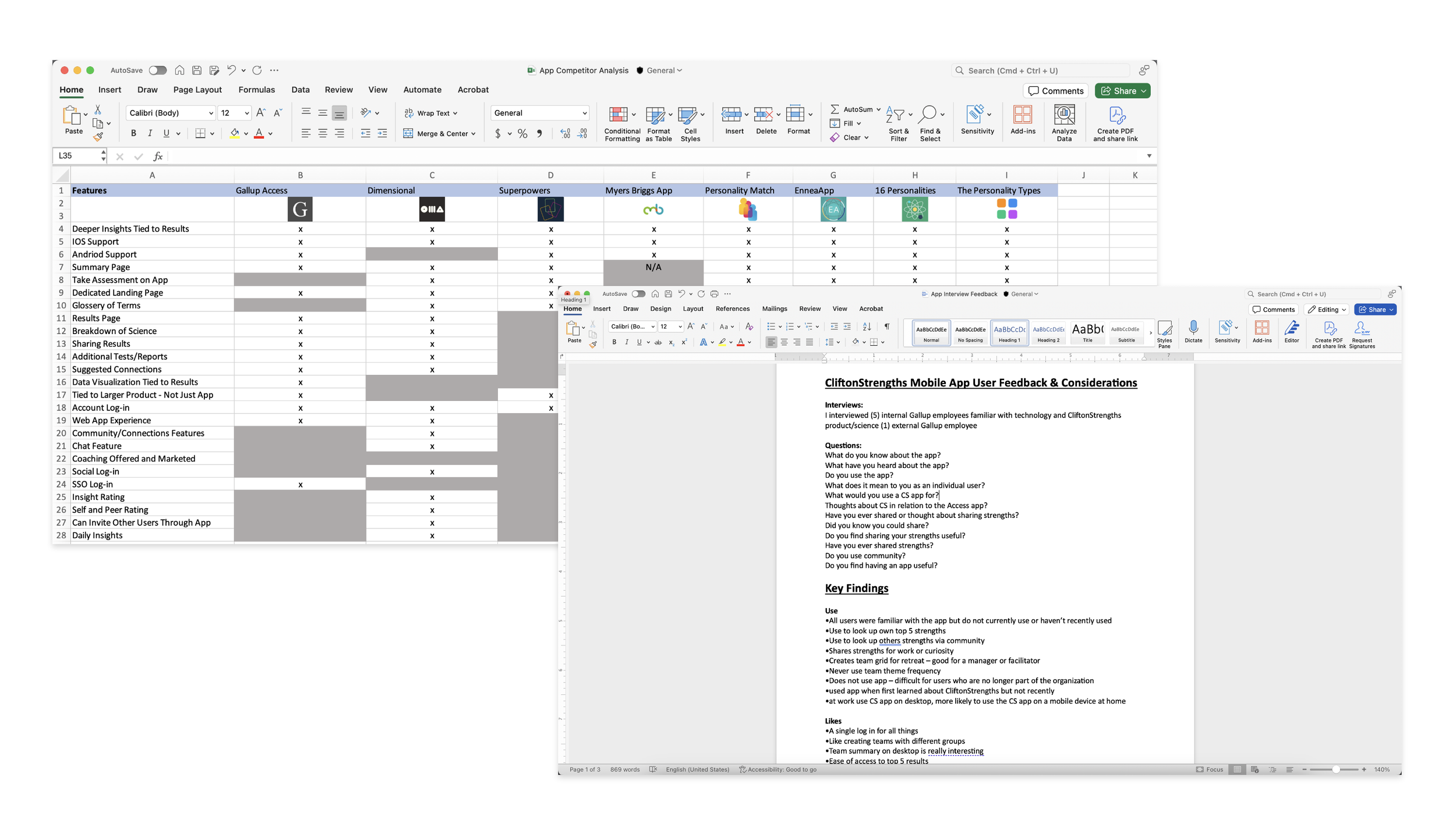
Competitor analysis and user interview notes
Key Finding: Although users completed initial activation, a lack of perceived ongoing value and lack of features led to poor retention beyond first use.
“I used the app once to look at my strengths. Once in a while I’ll use it to look up employee strengths, but I’m not sure how or why I would use it other than that.”
— Internal Power-User
Mapping Out the Current and Ideal Experience
Once I had a solid understanding of user problems, I mapped the current experience using a story map. This helped me better understand the existing app structure and strategically integrate new concepts and solutions. The story map provided a high-level view of existing features and flows, while also offering a holistic perspective on how new and existing elements could work together within the overall user experience. It also served as a collaborative artifact that cross-functional partners and stakeholders could review and react to.
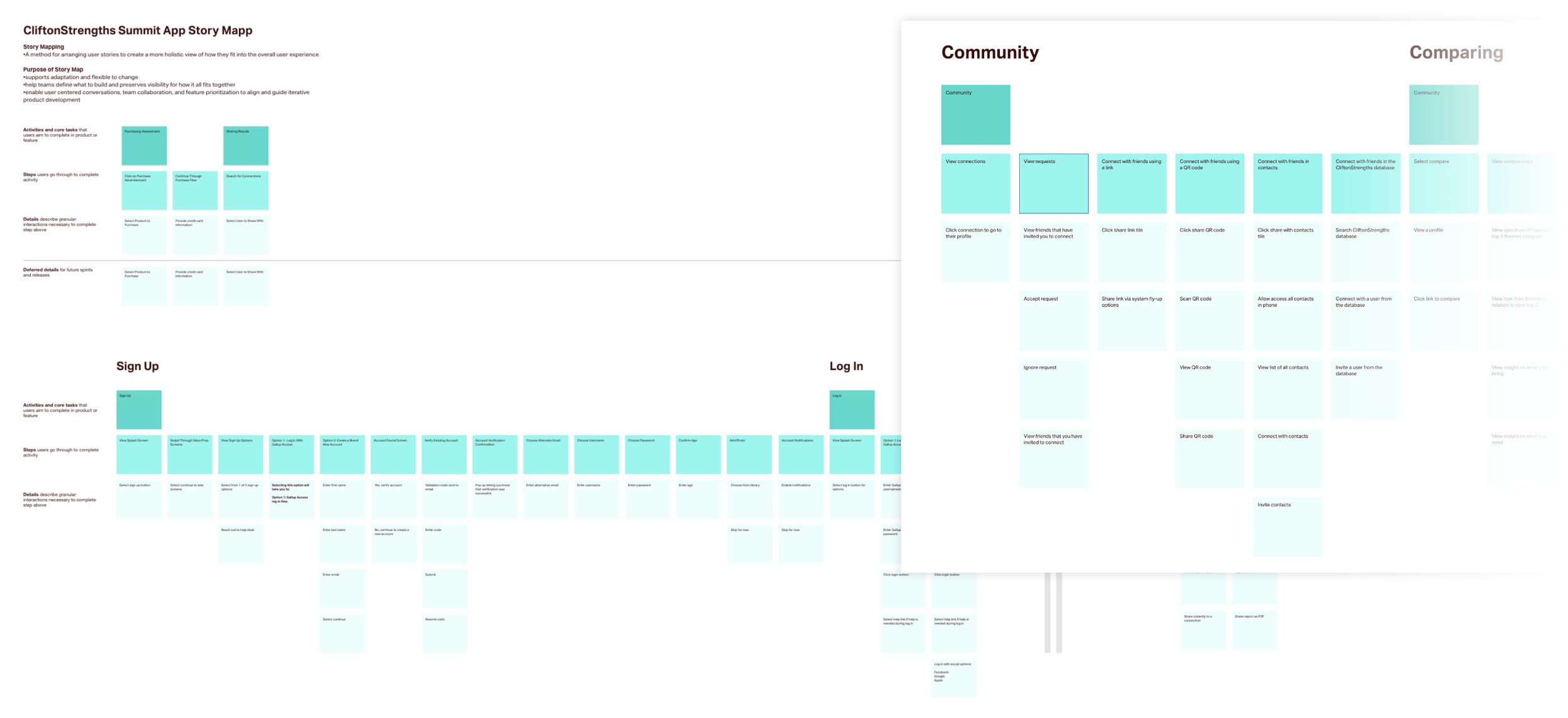
Story map documentation
Wireframes
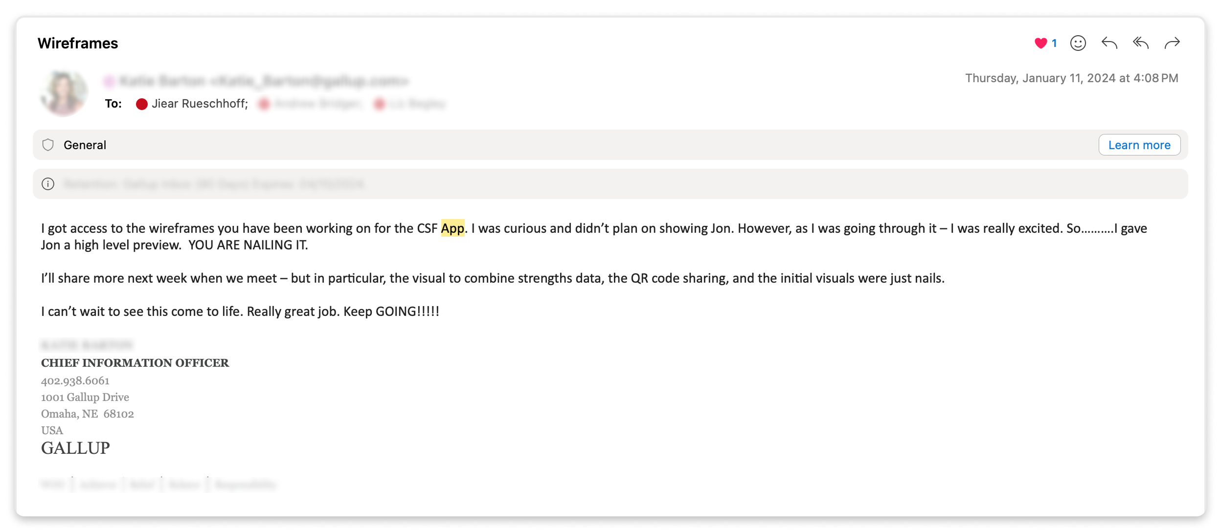
With the story map as a foundation, I was able to define the key functions and flows of the underlying system and document an ideal state built on it. I used these ideal state views to quickly ideate and produce concept wireframes for flows that didn’t yet exist in the app. I reviewed these wireframes with the CIO, CEO, and our vertical group, which included representatives from key departments across the organization. The CIO and CEO praised the wireframes and concepts, noting that I had delivered more than was initially expected.
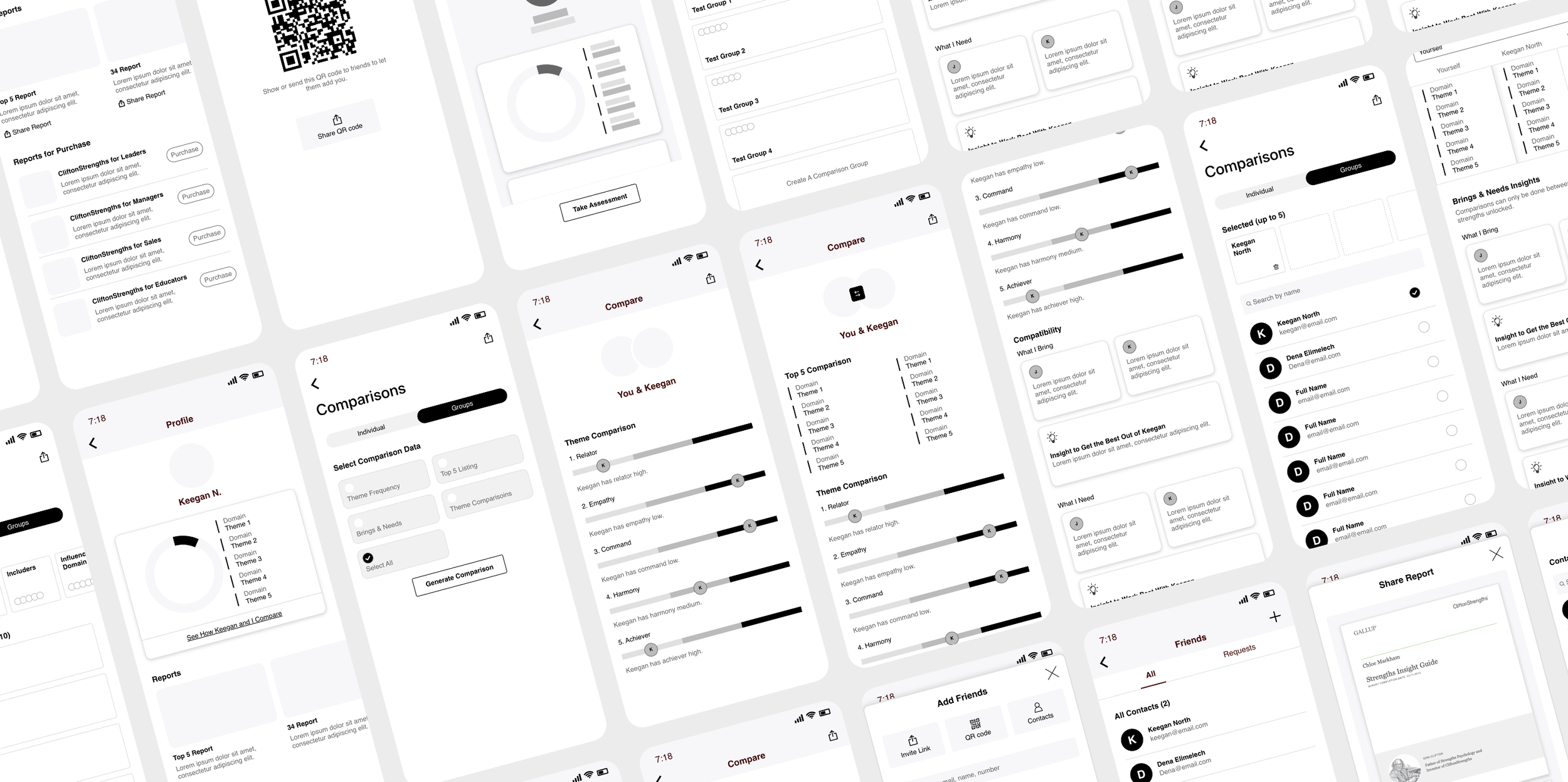
Using hi-fi wireframes to pitch concepts to stakeholders and leadership.
The wireframes clearly communicated early ideas and aligned everyone on a unified direction with a focus on QR Code sharing feature and accompanying strengths data visualizations. With focused feedback on the wireframes in hand, I dove deeper into the initial wireframes, refining them into finalized flows and screens to be ready for a technical review.
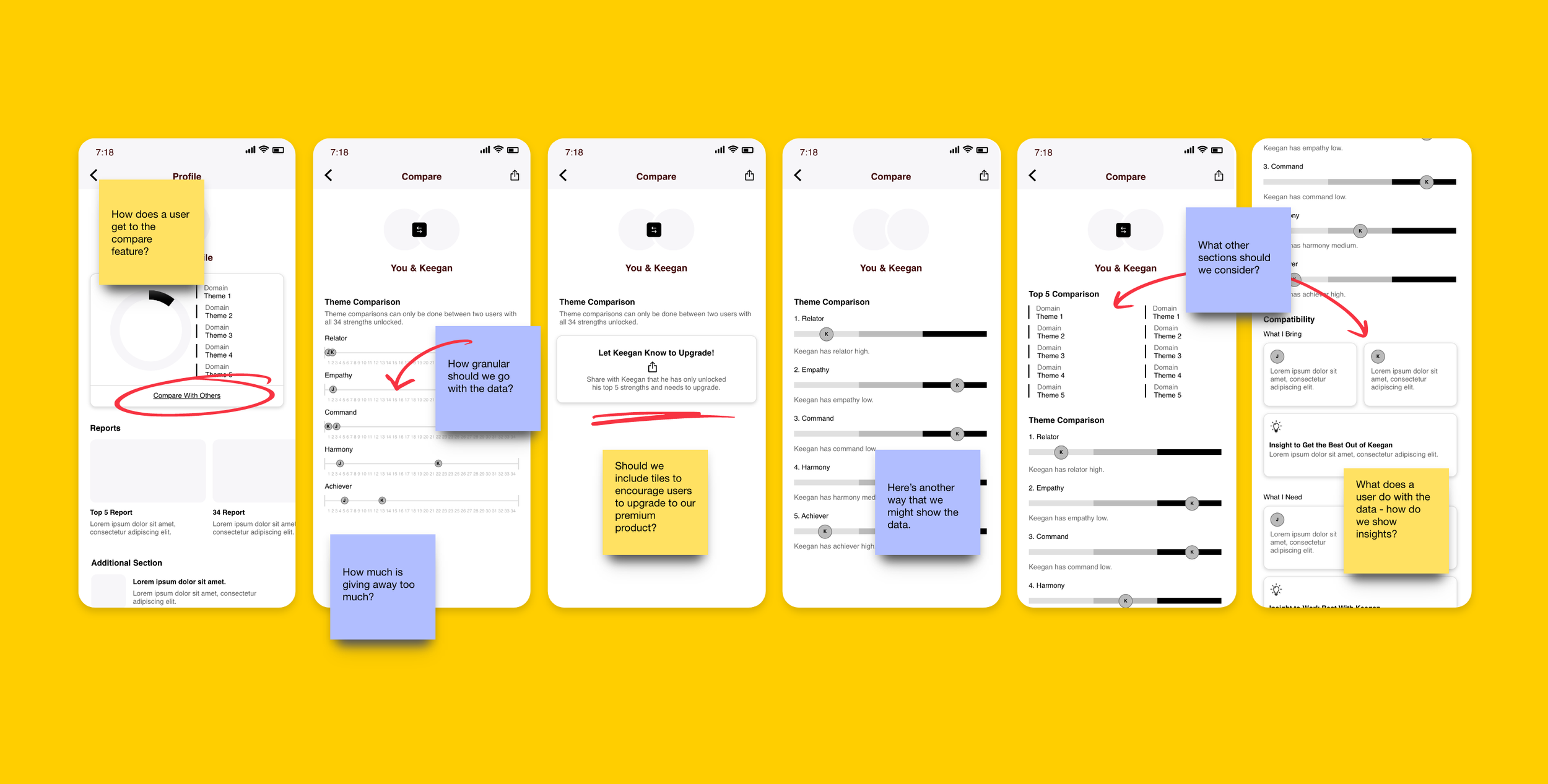
Comparison feature exploration
Additional Considerations
As we moved toward finalizing screens, one of our biggest challenges was determining how to integrate both enterprise and consumer experiences within the existing Gallup Access app. To address this, I proposed an updated navigation that simplified the app into three bottom tabs: the first tab serving as the main homepage for all Gallup Access products, the second tab providing a resources section accessible to every account holder, and the third tab dedicated specifically to CliftonStrengths and its features. I also mapped out the various combinations of products a user might have access to and created visuals showing how interface elements would adapt to each scenario. After much discussion, it was decided to keep the navigation as it and update the dashboard to make users more aware of the features.
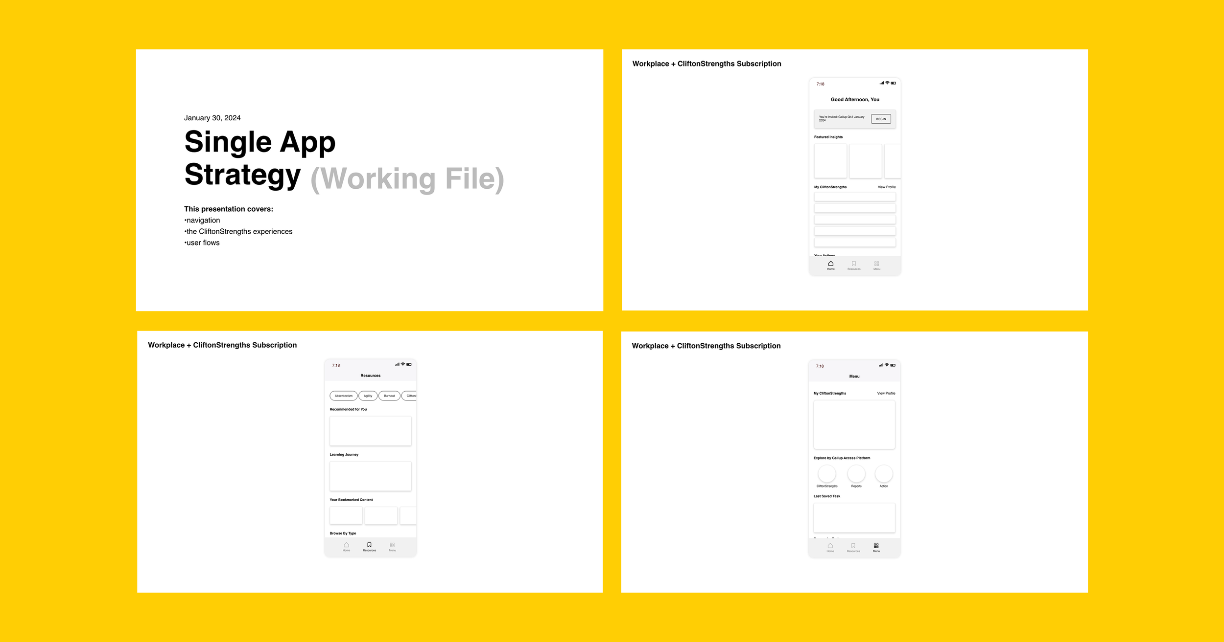
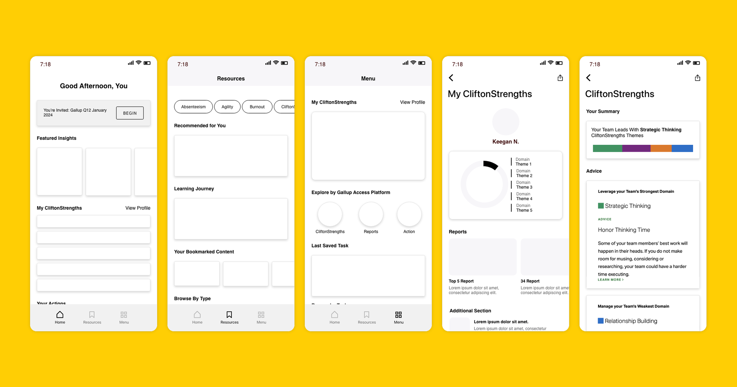
Presentation proposing how we might integrate the new experience into the existing one.
During the finalization of strategy and roadmapping for focused features, I learned that any new functionality introduced on the mobile app also needed to be reflected on the desktop experience. This led to extensive exploration of how to present the same data across different layouts and conveying the same information while scaling appropriately for each viewport.
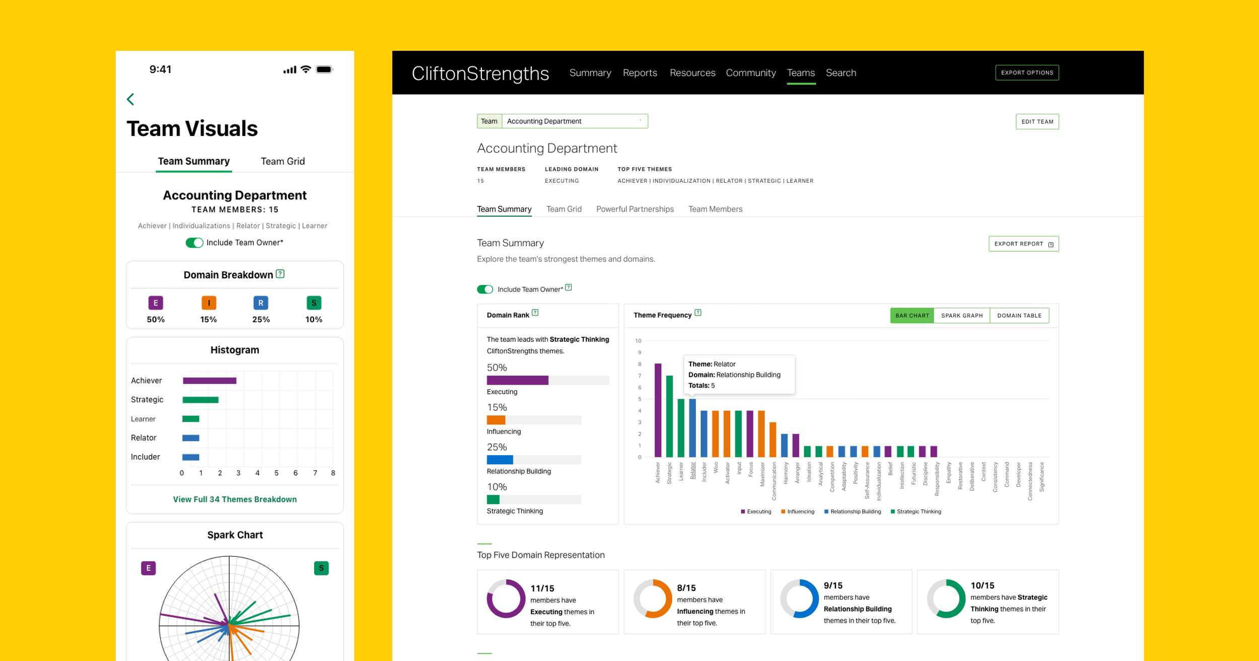
Accompanying desktop visualizations of the mobile experience.
Final Designs for Dev Handoff
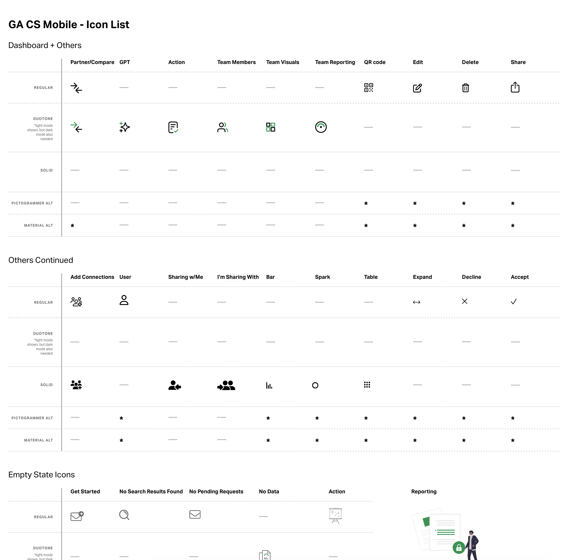
As we progressed through discussions with the tech teams and iterated on the final designs, we reached the stage of creating the final mock-ups. At this point, I collaborated closely with our mobile designer to captured all the necessary scenarios for the development team. Since we were working with an external development team, it was critical to maintain consistent design standards and visual language across all screens. We also focused on prototyping the designs thoroughly, and providing detailed specifications and assets to ensure the development team could implement the designs accurately and faithfully.
Final light and dark mode mock-ups for developer handoff.
Final light and dark mode mock-ups for developer handoff.
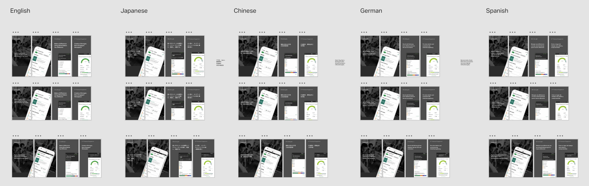
Localized images for the app store.
Final animated mock-up of the compare feature
Launch Day With the CEO
The team successfully executed the launch on schedule, delivering a standout moment for our CEO at Gallup’s annual Work Summit. The presentation was met with lots of praise and excitement from both the audience and our clients. It was a high-visibility moment that highlighted the strength of our work, the seamless coordination of the team, and our ability to create an impactful experience on a major stage.
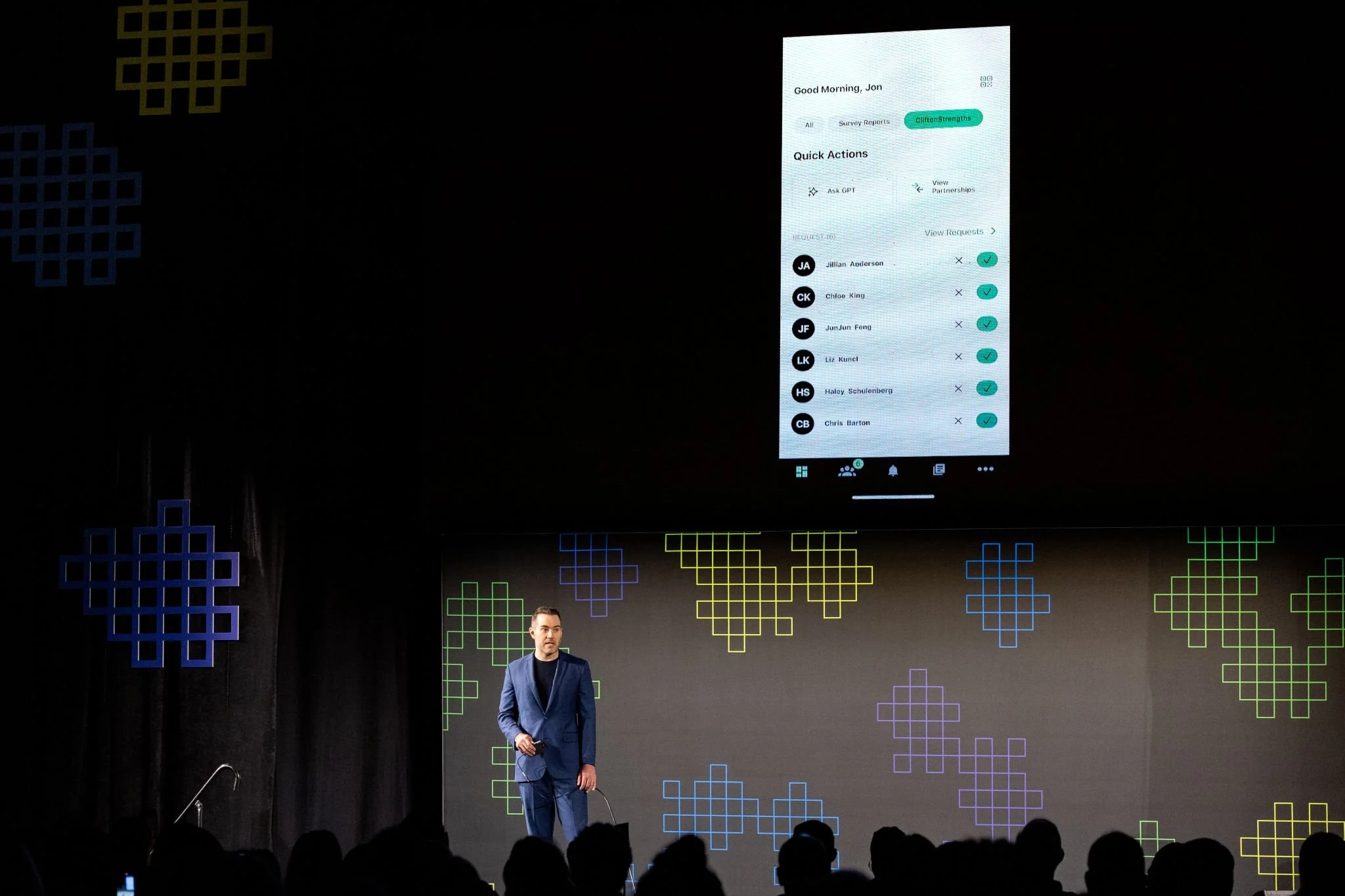
Gallup CEO, Jon Clifton, sharing the new app at Gallup’s annual workplace summit
Post Launch Metrics
35% growth in usage week 1 of launch
Increased app downloads by 10,000 in the first month after launch
Post Launch Quotes
“So appreciate ALL you do for this coaching community. Strengths changes lives in the most positive ways. Y’all are awesome.”
“What an incredible next version - a completely radical step but one I know will be embraced by individuals, teams, organizations, coaches and consultants alike. ”
Gallup News Homepage
Business Rules, Rule the Business
NewsLens